Investigate page features
Table of contents
Investigation period
For any investigation, BoostKPI compares two time-periods: the investigation period and the baseline period. The investigation period is the current time interval and the baseline period is computed based on the selected baseline and the investigation period.
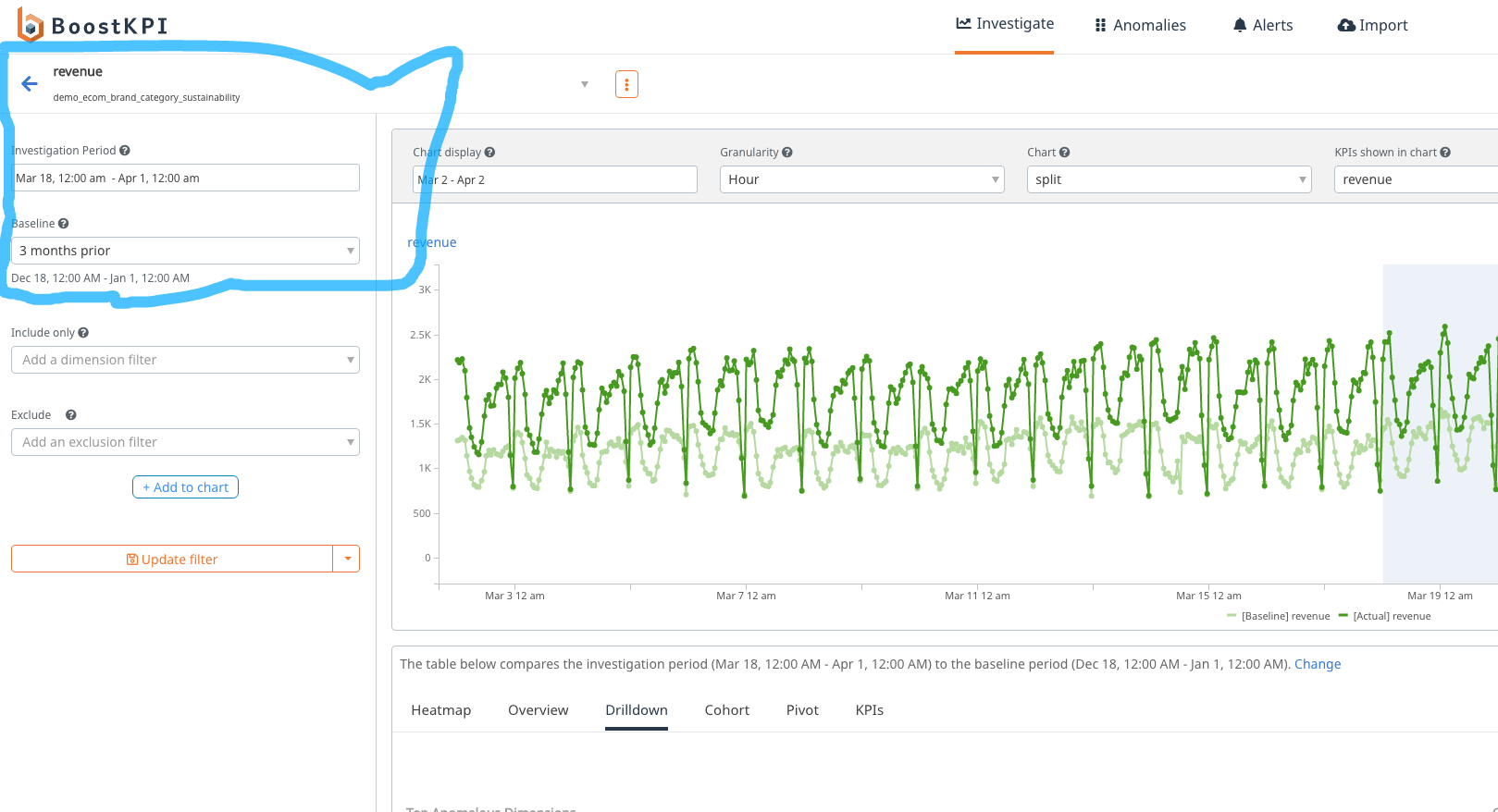
In the screenshot above, revenue is the KPI that is being analyzed, demo_ecom_brand_category_sustainability is the dataset, Mar 18 - Apr 1 is the investigation period, and 3 months prior defines the baseline, which is Dec 18 - Jan 1.
You can use the date filter to select a different investigation period. You can also select different baselines.
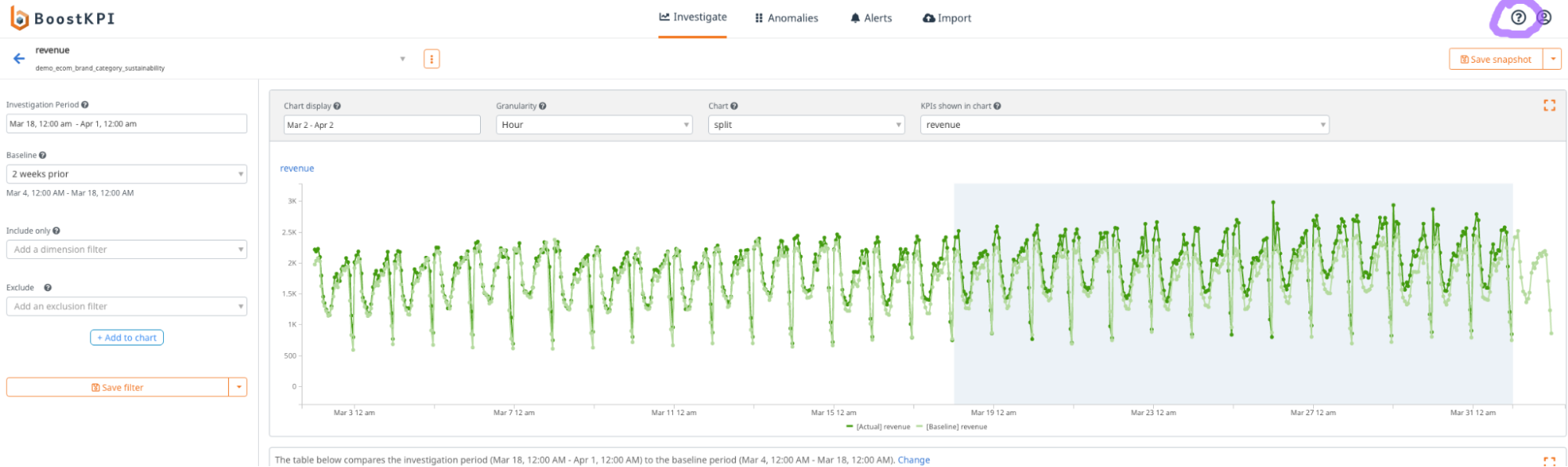
Baseline
The baseline defines the comparison time period. ‘2 weeks prior’ means that the baseline period is 2 weeks prior to the investigation period. The baseline period corresponding to the chosen baseline is displayed below the dropdown.
Some other possible values of baseline are:
5 days prior
The baseline period is set to the investigation period shifted 5 days prior. In the above example, it will be Mar 13 - Mar 27. Similarly, ‘10 days prior’ means that the investigation period is shifted by 10 days. Previously, the tool used do5d to refer to ‘5 days prior’.
1 week prior
The baseline period is set to the investigation period is shifted a week earlier. For a daily dataset, 1 week prior will have the same behavior as 7 days prior. Similarly, 3 weeks prior means that the investigation period is shifted 3 weeks prior. Previously, the tool used wo3w to refer to this baseline option.
mean4w
The baseline period is synthetically computed by averaging the values for each of the four prior weeks. If the investigation period contains May 29th, then the baseline value for May 29th is the average of the actual values for May 22nd, May 15th, May 8th, and May 1st. Baseline values for the rest of the investigation period are computed in the same manner.
meadian4w
The baseline period is synthetically computed by taking the median values for each of the four prior weeks (averaging the middle two). If the investigation period contains May 29th, then the baseline value for May 29th is the median of the actual values for May 22nd, May 15th, May 8th, and May 1st.
forecast
Fills in the baseline period with values computed via a machine learning forecast trained on the prior time period. Note: this baseline is not compatible with all the tabs below the timeseries.
Tabs
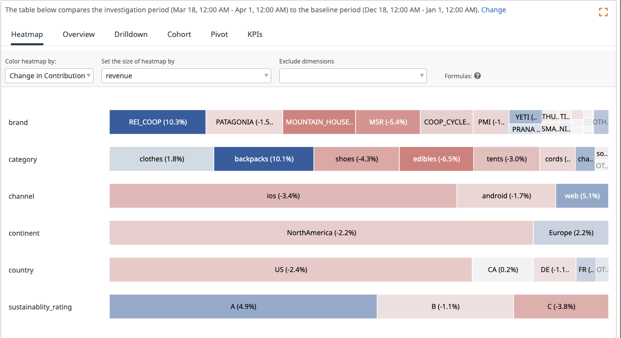
The heatmap shows a visual representation of the dimension values that are important (captured by the size) as well as the dimension values that are driving the most change (captured by the color. Red means the growth is negative, Blue means the growth is positive). The overview tab shows the heatmap values in a tabular format. The drilldown automatically shows the combination of dimension values that is driving the most change.
You can get contextual help by clicking the question-mark icon on the upper right.
Investigate page tour
You can get a tour by clicking the ? icon when you are on the investigate-page.

Heatmap interpretation
The default option is to color the heatmap by “percentage change”. If a cell is colored red, it means the KPI value decreased. If it is colored blue, the KPI value has increased. By default, the cell is sized by the contribution of the dimension value to the KPI. In the example below, the revenue for each channel ios, android, and web increased; so each cell is colored blue. Oval 1 and oval 2 in the screenshot below show the dropdown options to control the color and size of the heatmap. Hovering over a cell shows the KPI value for the dimension and the overall values (for example, REI_Coop revenue grew by 176.9%, which is shown in the dimension row of the hover, as in oval 3). Oval 4 shows the cell marked “OTHER” – it represents all the dimension values that are not shown individually in the heatmap. It is especially useful if the dimension has more than a few dozen values.
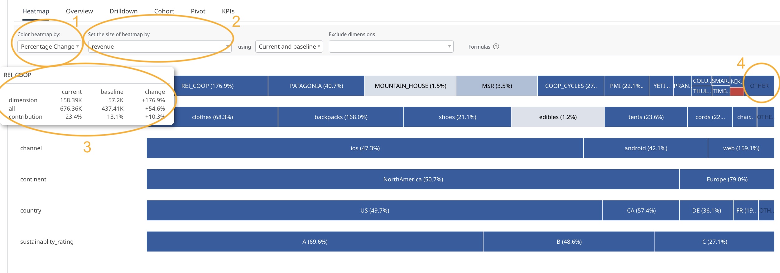
You can also view the changes normalized against the average change by selecting “change in contribution” (Change the dropdown in Oval 1). If the box representing a dimension value is colored red, it means it grew slower than average (even though it might have grown compared to the baseline time period).
Clicking a cell sets the correct filter and regenerates the heatmap.
If a KPI is a ratio or a percentage, the heatmap can still be used in the same way. To learn more about the details of how the heatmap works in such cases, look at our blog post on this topic.